
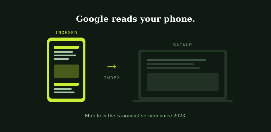
Google began rolling out mobile-first indexing in 2018. The roll-out finished in 2023. That long, quiet transition is mostly responsible for why this topic feels old to people who read SEO blogs but still trips up almost every site at audit time. The change has happened. The implications are still spreading.
So here is what "mobile-first" actually means, in the version of 2026 you are working in.
What "mobile-first" actually means in 2026
When Googlebot visits your site to crawl and index it, it visits as a smartphone user-agent. The HTML it sees, the content rendered, the structured data, the internal links, the images: all of these become the canonical record of what your site is. The desktop version still exists in Google's view of the world, but it is a reference, not the source of truth.
If the two versions of a page differ, the mobile version wins. Anything missing from mobile is, for ranking purposes, missing from your site. That is the rule in one sentence, and it is the rule that catches sites out at every other technical audit.
Where mobile and desktop quietly differ
The most expensive mobile-first mistakes are usually invisible to a human visitor on either device. The page looks fine on a phone. The page looks fine on a laptop. But what Googlebot reads from the mobile version turns out to be much thinner than the desktop equivalent. The patterns that cause this are familiar.
Content sections hidden behind tabs, accordions, or "read more" toggles, never expanded on the mobile load. Navigation collapsed to a hamburger menu without rendering the underlying link list in the HTML, so the internal links Google needs are unreachable to a crawler. Images that exist on desktop but get swapped for placeholder versions on mobile, or removed entirely to save weight. Structured data injected by JavaScript only on the desktop variant, missing from the mobile rendered HTML. The same logic at the rendering layer is unpacked in JavaScript SEO: when Google can't read your site. Long-form content truncated for "mobile UX" with the deeper paragraphs hidden by default.
None of these problems show up to a casual look. All of them quietly cap how well a site can rank.
The mobile audit, in five checks
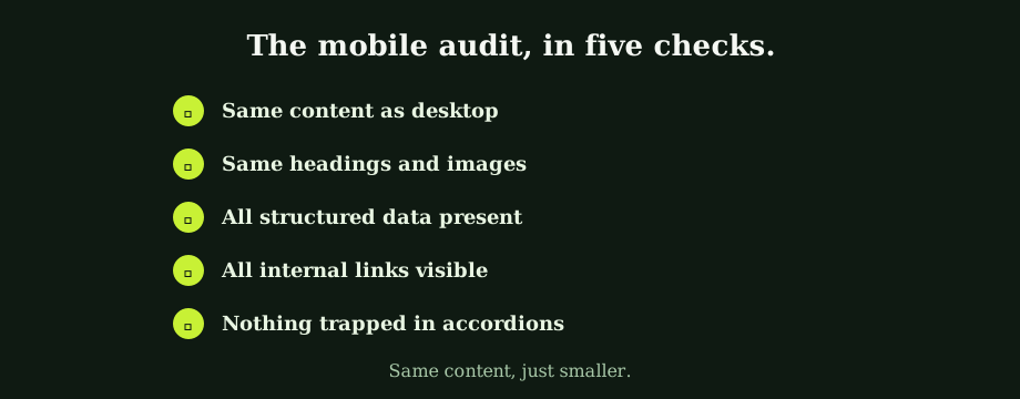
The same five checks, applied to any important page, surface most of the issues worth fixing.
- Same content as desktop. Word for word, paragraph for paragraph. If the desktop page has 1,400 words and the mobile page has 900, the gap is what Google is missing.
- Same headings and images. The H1, H2s, and important images should appear on both. Mobile responsive sizing is expected; mobile omission is not.
- All structured data present. View the rendered HTML on mobile and confirm any JSON-LD blocks that exist on desktop also exist there. The deep mechanics live in the plain guide to robots.txt and canonical tags and adjacent technical guides.
- All internal links visible. Open the mobile navigation. Are the links actually in the HTML, or are they injected only when the menu opens? Crawlers do not always trigger interactions, so the safer pattern is having the links present in markup from the start.
- Nothing trapped in accordions. Content hidden by default on mobile is treated as less important by Google than content shown by default. If a section matters, expose it.
The list looks simple. The fixes are usually template-level, which is what makes them low-effort high-leverage when you find them. The broader technical health checks sit in how to run a basic technical SEO audit yourself.
Why responsive isn't the same as mobile-first
Responsive design is the practice of building a layout that adapts to any screen size from the same underlying HTML. It is the right foundation for mobile-first, and most modern sites have it. The mistake is treating responsive as the destination rather than the starting point.
Two sites can both be technically responsive and still rank very differently. The one that performs is the one where mobile is not just visually accommodated but functionally equal: every piece of content, every link, every structured data block, every image, present and accessible at every viewport. The one that underperforms is responsive at the layout level but has stripped or hidden things to "improve mobile UX," which usually means making the design cleaner at the cost of what the crawler can see.
The cleanest way to think about this: build the mobile version as the real version, then expand it for larger screens. Most sites still build desktop first and shrink down. The order of operations matters more than the underlying technology.
Where mobile-first connects to the rest of SEO
Mobile-first changed the meaning of several other technical signals at once. Core Web Vitals are measured on mobile devices, not desktop, because that is the version Google is actually ranking. Page speed assessments use mobile baselines, which is why mobile load time has become one of the highest-leverage technical investments on most sites; the practical version of this argument sits in page speed for business owners.
Even structured data validation now happens against the mobile-rendered version of your page. If your schema only exists in the desktop HTML, Google does not see it. The rest of your SEO programme assumes the mobile version is the source. Aligning the two is foundational, not an optimisation.
What this changes for the everyday SEO work
Every audit, every redesign, every new page rollout should be checked on a mobile device before it goes to production. Not the browser's responsive emulator, an actual phone. The emulator is a useful first pass, but it misses real-world rendering quirks that only appear on actual hardware. Make this part of the deployment checklist and most mobile-first mistakes get caught before they affect rankings.
For sites built before 2020, a one-off mobile audit usually surfaces meaningful technical debt: hidden content, missing structured data on mobile templates, abandoned mobile navigation patterns from an earlier responsive framework. Most of those issues are template-level, so fixing the template fixes the site at once. That is the kind of high-leverage technical work a Bangkok SEO agency can plan and execute as part of a wider technical engagement.
Mobile-first sounds technical. It is also philosophical: Google decided your website is the version your users actually use. The site that wins is not the one with the prettiest desktop layout. It is the one where mobile got built first, and desktop became the considered expansion. Our SEO agency in Thailand handles mobile-first audits and the template work they usually surface as part of standard technical engagements. An SEO consultant in Bangkok can run the five checks above on your highest-traffic pages in less time than the rest of a sprint review takes.
Common questions
What is mobile-first indexing?
Mobile-first indexing is Google's policy, fully rolled out across the web by late 2023, of crawling and indexing sites primarily from the mobile version rather than the desktop version. In practical terms, when Googlebot visits a site, it visits as a smartphone user-agent. The HTML, content, structured data, internal links, and images it sees from that mobile view become the basis for ranking. The desktop version still exists in Google's understanding of the site, but as a secondary reference. If desktop and mobile differ, Google uses what mobile shows. Anything missing from the mobile version is effectively missing from Google's index, no matter how prominent it might be on desktop.
Is mobile-first indexing the same as responsive design?
No, and the confusion costs many sites real rankings. Responsive design means the same HTML and content reshape themselves visually to fit any screen size. That is the right starting point for mobile-first indexing because the underlying content is identical regardless of viewport. The problem is that many sites have responsive design at the layout level but still hide, collapse, or remove content on smaller screens through CSS or JavaScript. From Google's point of view, anything hidden by default on mobile is treated as less important, and anything removed from mobile is missing entirely. Responsive layout is necessary but not sufficient.
What happens if my desktop and mobile sites have different content?
Google indexes what the mobile version shows. Anything that exists only on desktop is, for ranking purposes, invisible. This is the single most common mobile-first mistake on otherwise well-built sites: rich desktop content with extensive copy, deep internal linking, and complete structured data, paired with a mobile version that drops sections, collapses navigation into a hamburger menu without exposing the linked pages, or removes structured data to reduce HTML weight. Sites in this state often look perfectly fine to a human visitor on either device but rank as if they were the lighter mobile version, because that is what Google reads.
How do I check if my site is mobile-first ready?
Open your site on an actual phone, not just the desktop browser's mobile preview. Read it from top to bottom and check that every piece of content you would expect to find on desktop is also visible. Then open Google Search Console and look at the URL Inspection tool for any important page. The tool shows you the rendered version of the page as Googlebot smartphone sees it, including the raw HTML and the rendered output. If anything looks missing, sections of text, images, internal links, structured data, that is what Google has to work with for ranking.